Flagship Case Study · LettrLabs
Shipped Product

Redesigning LettrLabs’ Map Workflow into an Audience Builder

I helped modernize a two-year-old geographic audience builder inside LettrLabs’ automation flow. The ask was to fix map bugs. The deeper problem: customers often needed Customer Success just to create an automation. So I shifted the work from “make the map better” to “help different users build audiences without getting blocked.”

Open map prototype Visit LettrLabs I built the prototype in Codex to make the interaction model tangible before engineering committed to implementation details.

Executive summary

The redesign shipped to production, clearing audited blockers on the primary targeting path and addressing the first phase of tracked map-and-automation tickets. I defined one audience model for five entry points, with CSV upload, saved areas, and exclusions deliberately phased for later releases.

My roleLed the audience-builder (map) design end-to-end; another designer owned the surrounding automation
OutcomeTurned scattered bug-fixes into one audience model, with a clear phased path from map-first use to five entry points
Timeline6 weeks
ProcessUses AI prototype
At a glance

The short version.

~95%of the product's automations are built on a map—this is the core surface, not a side feature
~75%of revenue rides on just 3 enterprise customers—concentrated risk on this one surface
~1,500automation users are the affected base this redesign had to hold up for
7 blockersaudited and removed from the primary targeting path
15 / 31tracked map-and-automation tickets addressed in phase one
6 wksfrom audit to shipped redesign

Usage and revenue figures come from internal analytics, rounded.

The problem

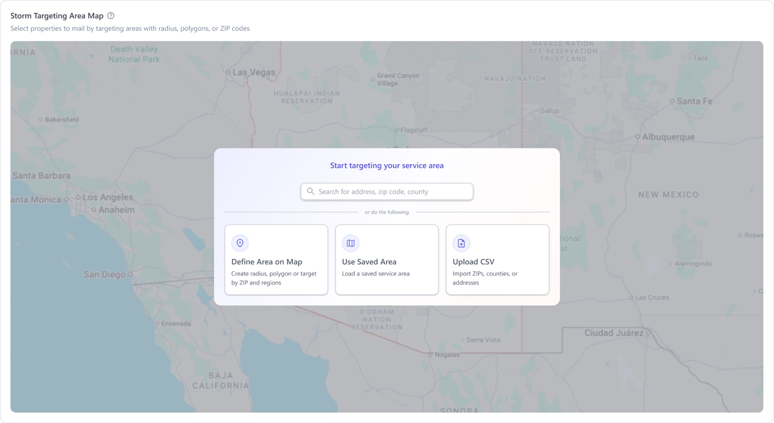
An old audience builder buried in the automation flow, with one way in: open the map, draw a shape. Think in ZIP codes, already have a CSV, want last month's area again? No entry point. So people called Customer Success or filed a ticket, and the same blockers showed up in both.

What I did

I led the audience-builder design end-to-end and changed the brief from "fix the map" to "help different people build an audience without getting stuck." ~20 customer interviews sorted into 4 user mental models; I translated them into one audience model with five entry points. Another designer handled the surrounding automation.

The outcome

Phase one shipped the map-first workflow and core targeting controls. The full five-entry-point model was defined for phased delivery, so later releases could add CSV upload, saved areas, and exclusions without reopening the interaction model.

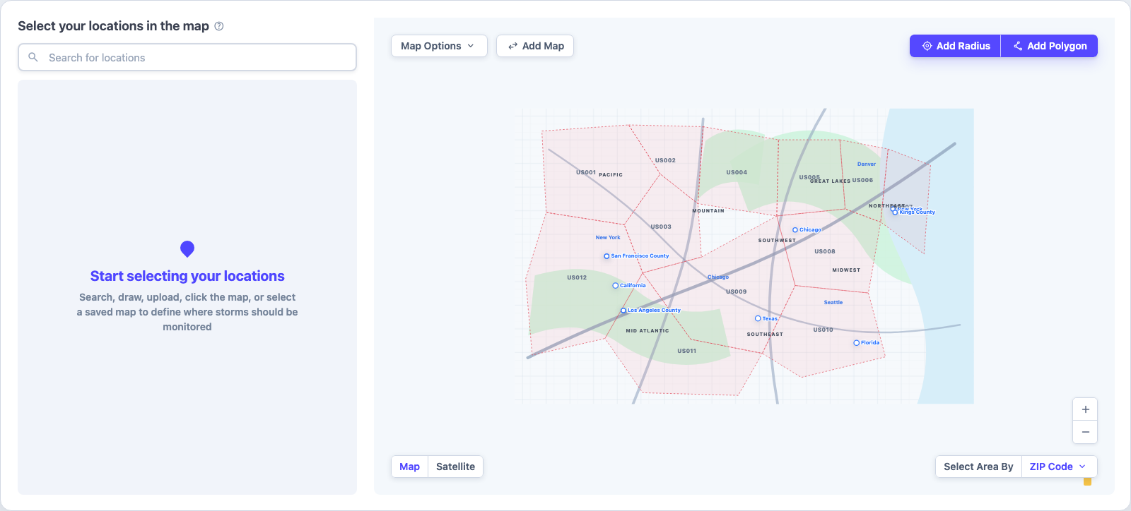
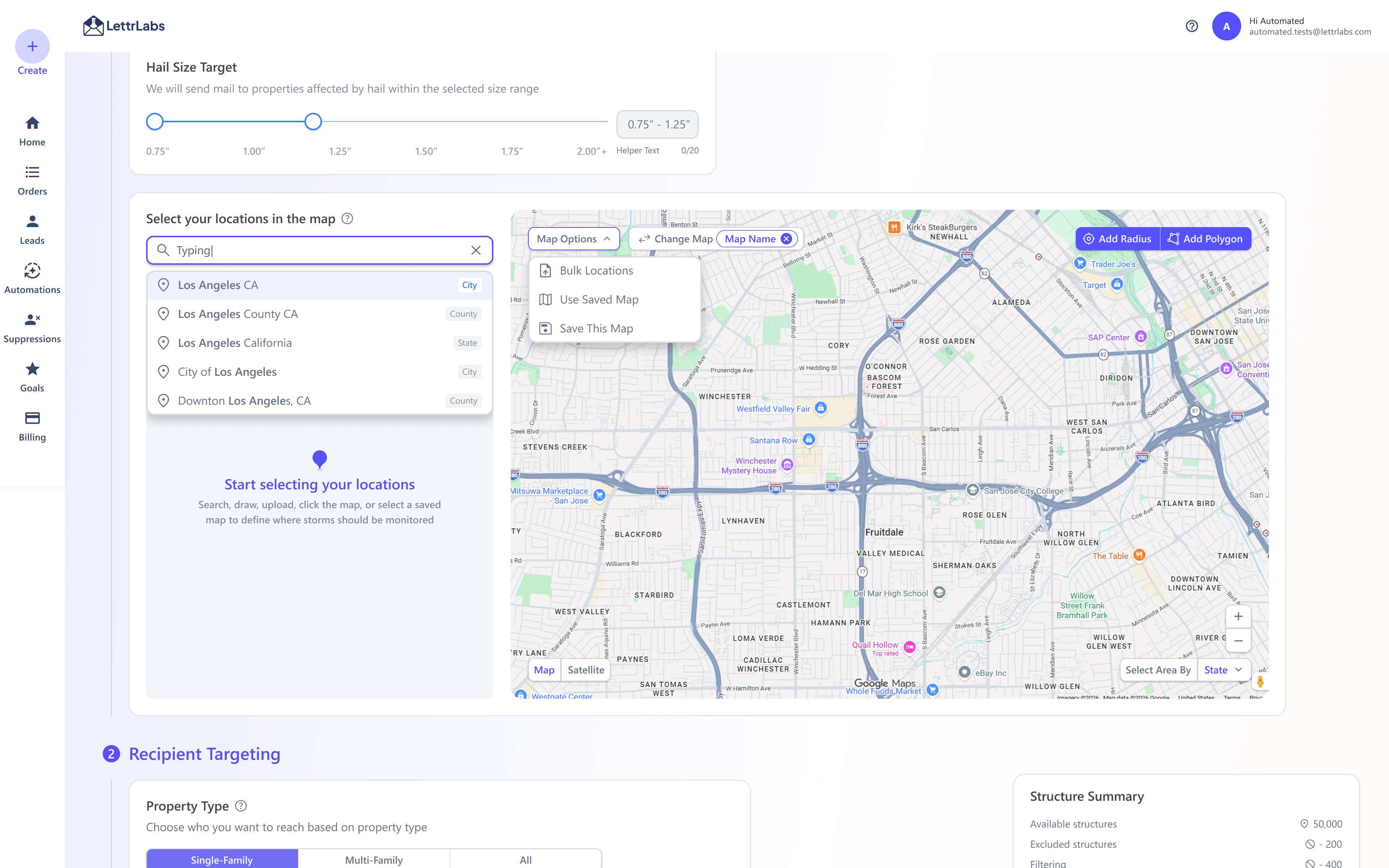
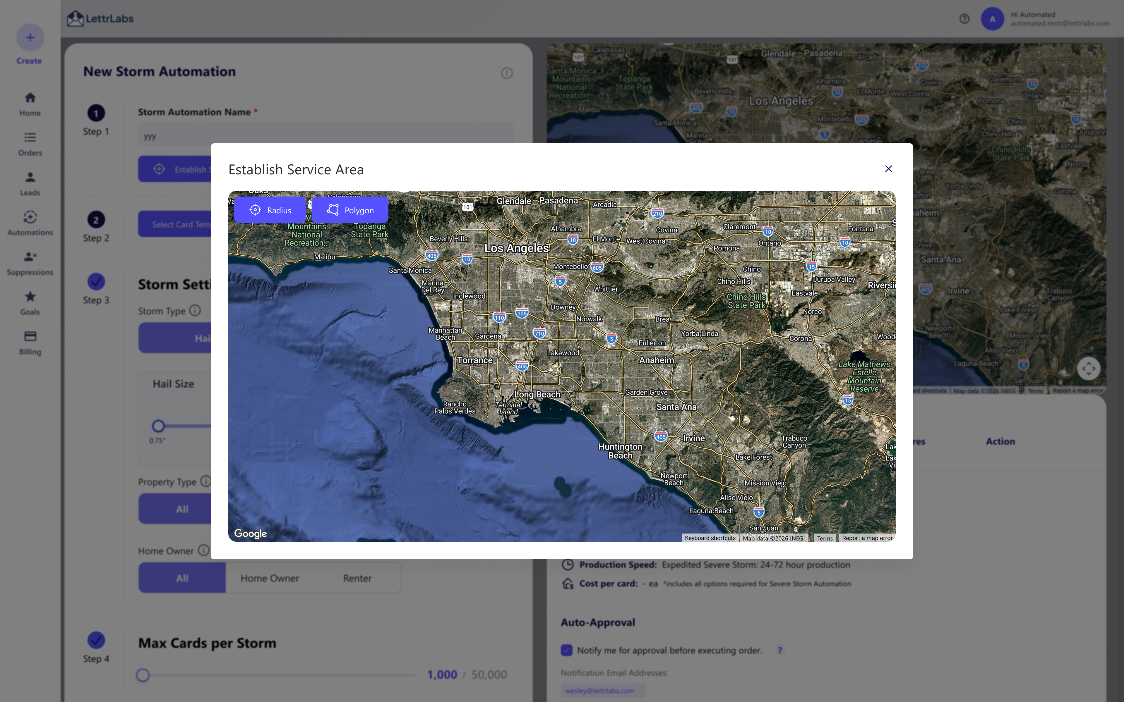
Old New Old map workflow inside an automation modal. New map workflow with reusable map controls, map context, and audience actions.
The question that changed the project

Why do customers need Customer Success just to create an audience?

It looked like a bug-fix pass on an old map. But the map wasn't the problem—the workflow around it was: setup gates, dead clicks, missing controls, and work people had to redo. So the real job was never the map controls. It was the way people already think about building an audience.

Before betting the redesign on that hunch, I checked it against every source I could get—comparing where people got stuck against where they moved easily:

Source
Evidence
Active users
~1,500 automation users
Product research
~20 interviews gathered by PM and CS, which I categorized into recurring patterns and personas
Behavioral data (Hotjar)
Heatmaps, drop-offs, and rage clicks I analyzed and mapped to specific broken actions, validations, and edge cases
Customer Success
31 map-related support tickets logged in Asana
UX audit
End-to-end workflow review of the existing targeting experience
AI evaluation
An AI “user” plus Playwright walkthroughs helped surface broken paths, compare bad flows against easier happy paths, and summarize the overall pattern across those answers.
UX audit

I used the audit to move the conversation from “bugs” to blockers.

The strongest signal was not that the UI looked old. It was that the product kept saying “not yet” without helping customers move forward.

Blocker
Fix
Users needed an automation name before adding locations.
I pushed to let users explore and build an audience before unrelated setup gates interrupted them.
Old users had to rebuild locations they already created.
Saved locations gave repeat users a faster way to reuse previous work.
Customers who targeted ZIP codes, counties, or states had to rely on drawing and radius tools.
Geographic selection supported ZIP, city, county, state, and broader targeting models.
Some clicks did nothing or gave weak feedback.
Loading, success, warning, empty, validation, and recovery states replaced dead-end interactions—designed to read without relying on color alone, with clear focus and keyboard states.
Users had control problems when they only wanted part of a larger location.
Inclusion controls shipped in the core path; exclusions were specified for the later refinement phase.
Filtering was slow enough that the primary path felt broken.
Engineering optimized filtering so the path stayed usable within the data constraints.
Support had become part of the setup process.
The redesign reduced dependency by making the primary path more self-explanatory and less blocked.

Read together, the blockers weren't random—the old flow treated everyone like one user: open the map, draw a shape, continue. But four mental models each expected a different way in, so the fix was to support all of them, then consolidate into one audience.

Persona summary

One workflow for four user mental models.

These personas did not need different products. They needed one audience-building workflow that could adapt to how they already thought about the task.

Power users

Operators already comfortable with audience controls and refinement logic. They start from CSV upload, include / exclude rules, and filtering—so import has to be fast, refinement precise, and complex edits reliable enough to hold together.

Local marketers

People who already know the geography they want to target—usually a ZIP, city, county, or state. Geographic selection has to work directly, without forcing drawing tools as the default path.

Repeat users

Customers returning to a workflow they have already configured before. They start from saved, reusable locations, so reuse has to be quick and carry continuity from prior campaigns with minimal rebuild.

New users

People who still need the visual reassurance of the map to orient themselves. They start with map-first exploration, so the product needs clear entry actions, visible guidance, and map feedback that teaches the workflow as they go.

Journey · before & after

Every stage had a clear path forward.

Rebuilt from the audit and behavioral data: phase-one improvements alongside the complete phased model that guided later releases.

Stage
Before — old map
After — shipped core + phased model
01Start automation

Must name the automation before adding any location—a setup gate.

Mild friction

Jump straight into building the audience; setup gates removed.

At ease
02Build an audience from any entry point

Blank map assumes you'll draw—no path for ZIP, CSV, or saved areas, and the first clicks do nothing.

Confused

Phase one made map-first search and geographic selection usable; CSV upload and saved areas were specified for later phases.

Clearer start
03Refine the area

No include/exclude—trim by deleting addresses one by one.

Tedious

Inclusion controls shipped; exclusion was specified for the later refinement phase.

More control
04Filter the audience

Filtering was slow enough that the primary path felt broken.

Impatient

Filtering optimized to hold up at scale, so narrowing an audience doesn't stall the flow.

Kept moving
05Review reach & cost

Overlapping selections are hard to read—no clear total to check.

Unsure

One consolidated audience—clear reach and cost.

Reassured
06Launch

Support becomes part of setup—31 map-related tickets logged.

Blocked

A clearer self-serve core reduced setup friction; saved-area reuse was phased for later delivery.

Ready to launch
Concept shift

The first concept was not what shipped.

The fork was task-first—let people pick how to start (search, saved area, upload) before touching the map—versus map-first, the existing, proven behavior. I shipped map-first to keep the launch low-risk on the surface almost every automation depends on, and documented task-first as an A/B hypothesis for a later phase. The version I'd design and the version that's safe to ship aren't always the same one—choosing which goes out, and when, is the job.

Why the concept changed

Product view

Start with the customer’s job.
Let CSV, saved areas, search, and map tools become equal entry points.
Reduce support dependency by matching how different personas already think.

Business view

Keep the map visible because it is central to the product experience.
Make the map feel more capable before users move into targeting details.
Preserve visual trust while still reducing the steps needed to build an audience.

Why PM agreed

Their research showed customers approached audience creation differently—one rigid map-first path didn't fit the clustered personas.

Why engineering agreed

Multiple entry points could still resolve into one audience model—easier to reason about than separate one-off workflows.

Why CS agreed

Support was mostly about reaching the audience customers already had in mind, not teaching more map interaction.

The final compromise kept the map prominent, but the product logic shifted. The job stopped being a better map screen and became a shorter, less fragile path to an audience—without giving up the map-led experience the business wanted.

Product strategy

I reframed the map as an audience builder.

That shift helped me decide what belonged in the experience and what stayed secondary. I specified search or region selection, CSV upload, saved areas, radius, and polygon as paths into the same model—so every entry point converges into one audience and people focus on total reach and cost, not the tool they used to get there.

One model, adapted to the job at hand.

Prototype walkthroughs show three representative paths through the shipped core and planned refinements.

Decision making

The hardest parts were not UI decisions. They were trade-offs.

I made the cost of each decision visible so PM, business, design, and engineering could align faster.

Question
Trade-off
Decision
Future

Was ~20 interviews enough to design from?

A confident sample is closer to 50, and PM and Customer Success ran these—so they were customer conversations, not a structured study.

Six weeks left no room for a proper research round, so I treated the interviews as one signal, not the answer. I triangulated them against Hotjar, support tickets, my own audit, and the AI walkthroughs, and only called something a blocker when it showed up in more than one source.

Run a structured round at ~50 participants, with a researcher, before the next phase.

Start with tasks or start with the map?

Task-first was clearer for CSV and saved-area users.

I shipped map-first: it was the proven behavior and the lower-risk choice on a surface almost every automation depends on. Validating task-first before launch would have delayed a release the business needed out, so I documented it as the next experiment instead.

I would still A/B test task-first.

Should clicking the map become the main interaction?

One-click selection was powerful, but folding radius, polygon, and place selection into one control would overload it.

I kept radius and polygon as primary CTAs and made place selection available through clearer map controls.

Test a combined select mode once there is more usage data.

Ship everything at once, or phase it?

A full release would be cleaner, but the scope touched targeting, filtering, saved locations, CSV, exclusions, and QA.

I scoped it so useful improvements shipped inside the window instead of waiting on an all-at-once rollout.

Use faster feedback loops between phases.

AI prototype

The prototype changed how the team discussed the problem.

I built the first interactive prototype in Codex—AI-assisted, so PM, business, and engineering could click a running product instead of imagining static Figma screens (a first for the team, so I wrote up the workflow for other designers). That's where validation happened: feeling out how it selects and adds places is what made clicking the primary way to build an audience, and it gave engineering something real to pressure-test.

View Initial Prototype

How prototyping changed the workflow

Before

Problem
PRD
UX strategy
Design
Engineering

With prototype

Problem
Working prototype
PM + CS feedback
Business review
Engineering feasibility
Design refinement

It also taught me to design with the constraints, not around them. The prototype reframed the map-provider call—this is an overlay-first service-area editor, not a navigation tool, so boundary rendering and visual control mattered more than Google's place familiarity—moving engineering from Google Maps to MapTiler (over Mapbox and MapLibre), with the edge cases and interaction model settled before any production code. My job was to define what had to stay legible—geographic selection, radius, polygon, large-dataset rendering, exclusions—and to hand off the concept and trade-off, not just the screen, so review became a product conversation.

Shipping strategy

This workflow sat on the critical path for automation, so waiting for a perfect release was not an option. I phased the work instead, so customers got the useful parts earlier and I could collect feedback between phases before investing in later functionality.

Phase 1
Search
Radius
Polygon
ZIP
County
State
Phase 2
CSV upload
Bulk locations
Phase 3
Saved locations
Phase 4
Exclude
*Collect feedback between phases and reiterate.
Design system
AI-READY SYSTEM

I built the Figma system to be AI-ready—so the prototype stayed consistent with the product.

I first standardized the Figma system around shared variables and built a checker for outdated layers, then used it as the source for AI-generated clickable flows and component guidance. Later, independently, I extended it into a coded React library with Storybook and machine-readable specs; at work, the immediate payoff was prototypes built from the real system's recipes, states, and copy—not a mock that would drift.

Read the design system case study →
ux-copy.md

UX copy guide

Brand personality, when to be brief versus instructive, length limits per surface, grammar rules. Structured, so designers and AI both write copy that already sounds like the product.

component-specs.md

Component specs

Every component documented—shared styling, the CSS where it matters, explicit do's and don'ts—so reuse follows one source of truth, not tribal knowledge.

qa-audit.md

QA & audit rules

Patterns, common violations, known deviations. Any new design gets audited against it, so problems come back as rule-breaks instead of opinions.

The same system made accessibility a spec, not a cleanup.

A map-based tool is exactly where accessibility gets skipped—but because the rules live in that system, it was a constraint from the start. Here's what it held to on the shipped UI. (Ratios sampled from the shipped LettrLabs UI.)

Contrast 12.9:1 primary text AAA 15.2:1 nav on dark AAA 6.5:1 muted text AA 5.0:1 button label AA
Built in Keyboard-operable Visible focus Never color alone Errors tied to the field Screen-reader checked
How it was tested

Automated + manual, not just a scan

Automated checks ran in axe DevTools against WCAG rules. Those catch only a fraction of real issues, so that pass was the floor—the manual one is where this became usable.

Manual pass — every flow
  • Everything runs on Tab, Shift+Tab, Enter, Space, arrows
  • Focus visible, in a logical order
  • Modals trap focus and return it on close
  • Holds at 200–400% zoom and narrow widths
  • Meaning never carried by color alone
  • Errors, instructions, loading and success states read clearly
  • Map, menus, tooltips and drag-and-drop have accessible alternatives
Map audience builder

The final direction turned targeting into a workspace, not a one-path map tool.

The interaction model brings search or region selection, CSV upload, saved areas, radius, and polygon into one audience-building context. Phase one shipped the map-first path; the remaining entry points are designed for the later phases shown above.

LettrLabs audience builder prototype preview

The interactive prototype loads only when you press play.

Outcome

The redesign shipped and turned the map into a stronger automation foundation.

The win was not a cleaner interface. It was a workflow that matches how customers actually build audiences.

01 / CUSTOMER · DESIGNED + PHASED

From one rigid path to a five-entry-point model

Audit and observed-session evidence showed 6 steps before a single area was drawn, with roughly 3 repeated per additional location. I defined search or region selection, CSV upload, saved area, radius, and polygon as one model; phase one shipped the map-first path and core targeting controls.

Step counts from the UX audit and 20 observed customer sessions.

02 / BUSINESS · SHIPPED

De-risked a revenue-critical path

The redesigned audience builder shipped on the surface behind ~95% of automations and serving the 3 enterprise accounts carrying ~75% of revenue.

03 / ENGINEERING · DEFINED BEFORE BUILD

One interaction model, ready for build

4 map providers were evaluated and the interaction model was specified across ~55 states spanning 13 flows, with entry methods, calculation states, and failure cases defined for QA.

04 / SUPPORT · PHASED

15 of 31 tickets addressed in phase one

The remaining 16 issues were scoped across later releases for CSV upload, saved maps, and exclusions. Ticket deflection and completion are the next measures to validate as those phases ship.

Reflection & what's next

The task-first idea deserved a test—but the compromise was right.

My strongest rejected idea was a task-first entry: pick the map, a CSV, or saved locations up front. It would have helped people who arrive with a clear job—but some customers need the map first to orient and trust the flow.

What I'd do with more time: A/B the task-first entry against the shipped map-first flow, per persona—tracking time to first audience, map CS tickets, completion, filtering abandonment, saved-location reuse, and paid-filter conversion.

Future opportunities

Audience creation outside automation. Build an audience once, save it, and reuse it across automations. It didn't fit the first release, but it's the better architecture—it narrows the on-screen job to one thing.

Live insight on the map. A real structure or household count as you select an area. Today that's a separate pass on USDA-backed sources; once the data is self-hosted, the map can show it while you draw.

Paid audience insight. The same audience model could support LettrLabs-owned data, premium filters, and ROI-based recommendations; these are future product directions, not realized revenue.

“I stopped optimizing for map interactions and started optimizing for how people think about building an audience.”